Firefox Onboarding Emails
2022
Context
Firefox sends onboarding emails to all users who sign up for a Firefox account. We wanted to refresh the onboarding journey emails with updated visuals and content.
Objective
We hoped to convince Firefox account holders to sign up for our newsletter, our biggest retention channel, by providing them with compelling onboarding content.
Metrics
Our goals were to drive sign-ups to the Firefox newsletter, drive mobile downloads and have account holders set Firefox as their default browser.

Role | Designer
Team | Designer • Copywriter • Lifecycle Marketing Manager
Duration | 2 weeks
Tools | Figma • Microsoft Word • Adobe Illustrator
Auditing the Landscape
I began my design process by auditing the landscape of onboarding emails. I looked for best practices surrounding the number of features & products to include per email, the number of emails in an onboarding set, the types of CTAS, and the visual presentation of the emails.
Takeaways
1. Give value prop in intro
2. Promote no more than three features per email
3. Keep copy minimal.

Stepping Back from the Brief
This project had been backlogged for a year and came with the baggage of a bloated brief. The team had a lot of questions surrounding the order of content, user journey, and ideas for A/B testing. We decided to take a step back to flesh out the ideal content & user flow for the emails by conducting a whiteboard session with the full EU Studio Team.

Presenting Rationale to Stakeholders
From our whiteboard sketches, I developed wireframes showing the user journey of each email that we shared with our stakeholders. We explained the ways in which our mocks diverged from the brief, the content we chose to include in each email, and our rationale behind each decision from a user standpoint.

Design Development
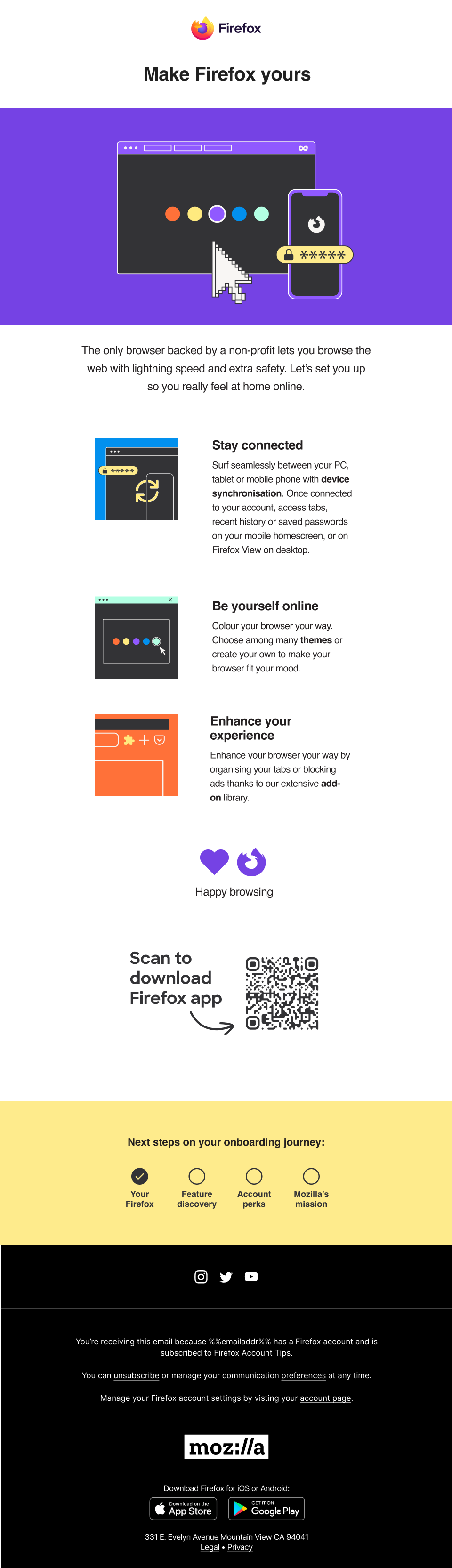
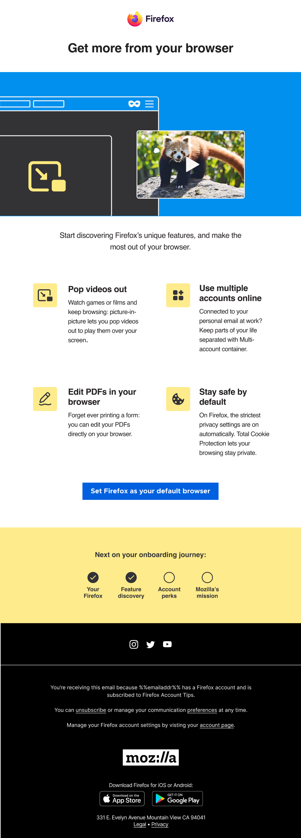
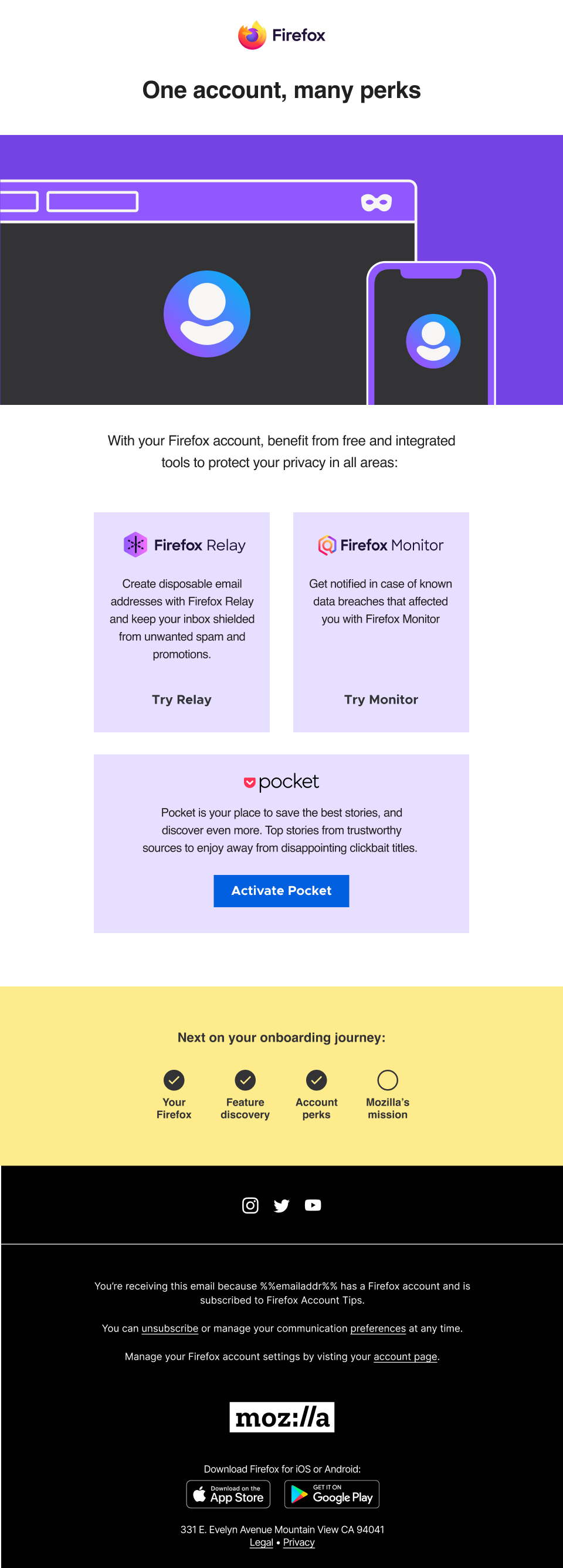
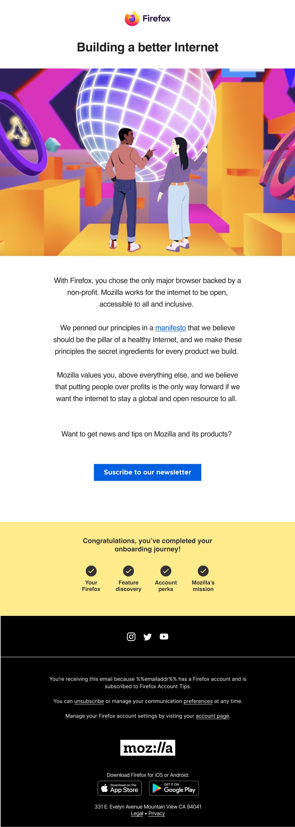
I set off to design the set of four emails leveraging our brand toolkit as well as illustrative work from a recent campaign that showcased a number of Firefox features and products. My intention was to create a cohesive user experience that felt simple and inviting. I followed the best-practices gathered from my visual audit.

Final Designs